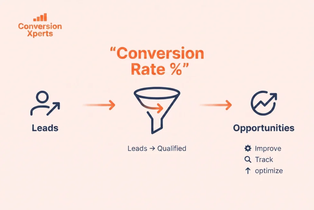
How to Improve Conversion Rate on Website: The Complete Step-by-Step Guide (2026)
Understanding Why Your Website Is Not Converting
Before you change a single word of copy or move a single button, you need to understand the specific reason your website is not converting. This is where most businesses go wrong. They start changing things based on instinct rather than evidence, and they end up with a page that looks different but performs the same.
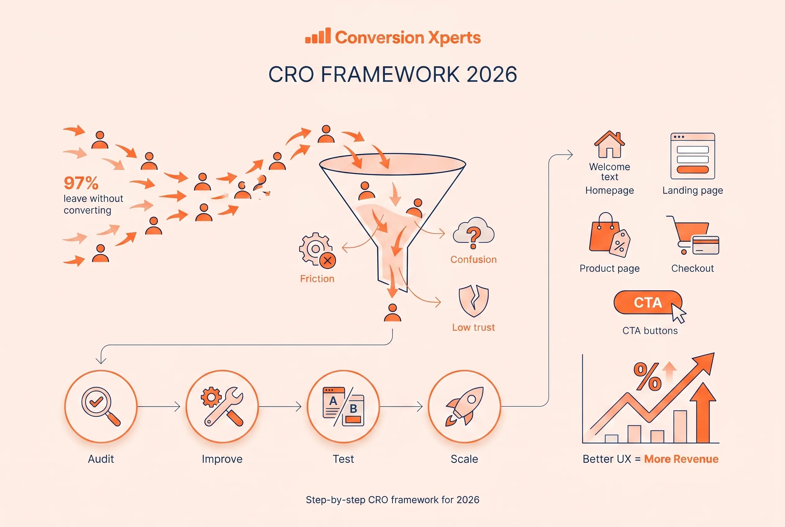
There are five root causes behind almost every low conversion rate.
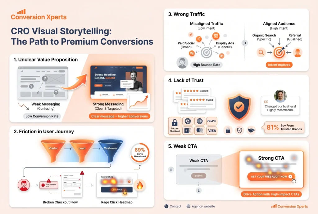
Root Cause 1: Unclear Value Proposition
A value proposition answers one question in the visitor’s mind the moment they arrive: why should I choose you over every other option available to me? If your page does not answer that question clearly within the first five seconds, most visitors will leave without ever reading another word.
According to a 2024 study by the Nielsen Norman Group, visitors form a first impression of a website within 50 milliseconds. Within five seconds they have already decided whether the page is relevant to them. Your value proposition is almost always the deciding factor.
The most common value proposition mistakes are being too generic, focusing on features instead of outcomes, and using industry jargon that visitors do not recognize. “We deliver innovative synergistic solutions for enterprise growth” communicates nothing. “We help B2B SaaS companies reduce churn by 40% in 90 days” communicates everything a qualified prospect needs to know to keep reading.
Root Cause 2: Friction in the User Journey
Friction is any element of the user experience that makes it harder for a visitor to take the action you want them to take. Friction comes in three forms: physical friction, cognitive friction, and emotional friction.
Physical friction includes slow page load times, broken links, forms with too many fields, and checkout processes with unnecessary steps. Cognitive friction includes confusing navigation, unclear instructions, too many choices, and copy that is hard to read. Emotional friction includes lack of trust signals, fear of commitment, concern about privacy, and anxiety about making the wrong choice.
A 2024 Baymard Institute study found that 69% of online shopping carts are abandoned before purchase. When they surveyed the abandoning shoppers, the top reasons were all friction-related: unexpected costs, being forced to create an account, a complicated checkout process, and not trusting the site with payment information.
Root Cause 3: Wrong Traffic
Sometimes the conversion problem is not the page at all. It is the mismatch between what the traffic expects and what the page delivers. If you are driving visitors who are in early research mode to a high-pressure purchase page, you will have low conversions regardless of how well the page is optimized.
Segment your analytics by traffic source and compare conversion rates across channels. Organic search traffic typically converts differently than paid social traffic. Direct traffic converts differently than email traffic. Understanding these differences helps you match page content to visitor intent, which is one of the fastest conversion rate improvements available.
Root Cause 4: Lack of Trust
Visitors who do not trust your website will not convert. Trust is built through a combination of visual credibility, social proof, transparency, and security signals. Its absence is felt immediately even when visitors cannot articulate exactly why they feel hesitant.
According to Edelman’s 2024 Trust Barometer, 81% of consumers say they need to trust a brand before making a purchase. For newer or lesser-known brands, building trust on the page itself is not optional. It is the primary conversion challenge.
Root Cause 5: Weak or Missing Call to Action
The most common reason visitors do not take action is simply that they were never clearly asked to. Weak CTAs, buried CTAs, confusing CTAs, and pages with no CTA at all are shockingly common even on professionally designed websites.
Your call to action must be visible, specific, benefit-oriented, and repeated throughout long pages. Visitors who reach the bottom of a page without seeing a clear next step will simply leave. Every page on your website should have one primary action you want the visitor to take and that action should be made obvious.
How to Improve Conversion Rate on Website Through Messaging
Your words do more conversion work than any design element. Copy is the primary conversion lever on every page of your website. Before you redesign anything, test your messaging.
Write for the Visitor, Not for Yourself
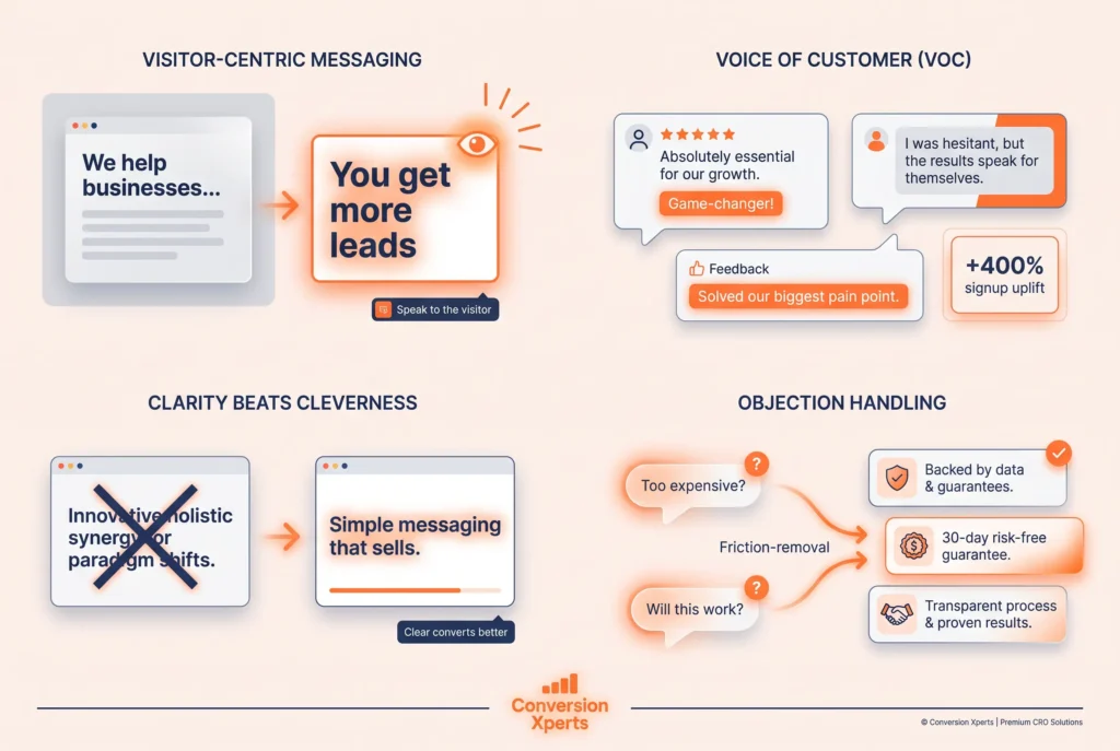
The most fundamental shift in conversion copywriting is moving from company-centric language to customer-centric language. Most businesses write about themselves. High-converting websites write about the visitor.
Count how many times your homepage uses the words “we,” “our,” and “us” compared to “you” and “your.” If the company-centric words outnumber the visitor-centric words, you have a messaging problem that is almost certainly suppressing conversions.
Visitor-centric copy focuses on transformation. What does the visitor’s life, business, or situation look like after they use your product or service? That transformation is what they are actually buying. Your product is just the vehicle that gets them there.
Use the Voice of Customer in Your Copy
Voice of customer (VOC) research involves using the exact words and phrases your customers use to describe their problems, goals, and experiences. When you mirror this language back to visitors on your website, they feel an immediate sense of being understood.
Collect VOC data from customer reviews, support chat transcripts, sales call recordings, post-purchase surveys, and social media comments. Look for recurring words, phrases, and emotional themes. Then weave those exact phrases into your headlines, subheadings, and body copy.
This technique is extraordinarily effective because it eliminates the cognitive gap between how you describe your product and how customers think about their problem. Joanna Wiebe, founder of Copyhackers, documented a 400% increase in trial signups for one client simply by rewriting the headline using language pulled directly from customer reviews rather than internal marketing language.
Clarity Always Beats Cleverness
Clever headlines feel good to write. Clear headlines convert better. When a visitor has to work to understand what you are saying, they do not work harder. They leave.
This does not mean your copy needs to be boring. It means the primary message must be instantly understandable before any stylistic flourishes are added.
Test your headline with someone outside your industry. If they cannot immediately explain what your company does and who it serves after reading the headline and subheading, your clarity problem is costing you conversions every single day.
Address Objections Directly in Copy
Every visitor who reads your page has objections. They are thinking “this is too expensive,” “I am not sure this will work for my situation,” “I do not have time to implement this,” or “I have tried something similar before and it did not work.”
High-converting pages anticipate and address these objections in the copy rather than hoping visitors will not think of them. A pricing page that says “No long-term contracts. Cancel anytime.” directly addresses the fear of being locked in. A product page that says “Works with your existing tools, no technical setup required” addresses the objection about implementation complexity.
According to a 2023 Forrester Research report, buyers who encounter objection-handling content during the consideration phase are 1.9 times more likely to make a purchase than buyers who do not.
Homepage Conversion Rate Improvements That Work
Your homepage is usually your most visited page and your highest-stakes conversion opportunity. It serves multiple audiences with different levels of awareness and intent, which makes it uniquely challenging to optimize.
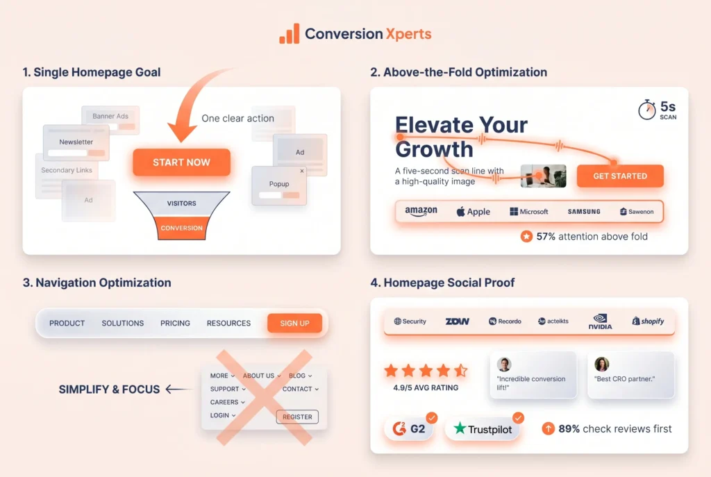
Structure Your Homepage Around a Single Primary Goal
The most common homepage mistake is trying to serve everyone simultaneously with no clear hierarchy of importance. Links to every product, every blog post, multiple calls to action, and an overwhelming amount of information create what UX researchers call “banner blindness” combined with choice paralysis.
Decide on one primary action you want the majority of homepage visitors to take. Everything on the homepage should support that action. Secondary actions are acceptable but must be visually subordinate to the primary one.
For a SaaS company, the primary homepage goal is typically starting a free trial or booking a demo. For an ecommerce brand, it is usually guiding visitors to a product category or featured collection. For a service business, it is typically requesting a consultation or viewing a portfolio.
Above the Fold: The Five-Second Test
Above the fold is the portion of the page visible without scrolling. Research from the Nielsen Norman Group in 2024 confirmed that visitors spend 57% of their total page viewing time above the fold. The content in this zone determines whether visitors scroll further or leave.
Your above-the-fold section should accomplish five things without requiring any scrolling. It should clearly state what you do. It should identify who you serve. It should communicate the primary benefit or outcome. It should provide a compelling primary CTA. And it should include at least one trust signal such as a customer count, a press mention, or a recognizable client logo.
If a visitor can answer “what is this website and why should I care” within five seconds of landing on your homepage, your above-the-fold section is doing its job.
Navigation Optimization
Navigation menus are one of the most overlooked conversion factors on homepages. A navigation bar with too many options creates analysis paralysis and pulls visitors away from the conversion path before they have been properly warmed up.
Eyetracking studies conducted by the Nielsen Norman Group in 2024 found that visitors spend approximately 6.44 seconds reading website navigation. During those seconds, too many options increase cognitive load and reduce the likelihood of any meaningful click.
Limit primary navigation to five or fewer items. Move low-priority pages like legal, careers, and investor relations to the footer. Place your highest-priority CTA such as “Start Free Trial” or “Book a Demo” in the top-right corner as a contrasting button separate from the standard navigation links. This single change has produced conversion lifts of between 15% and 30% in documented A/B tests across multiple industries.
Social Proof on the Homepage
The homepage is where visitors are forming their first impression of your brand. Social proof at this stage reduces skepticism before it has time to calcify into a decision to leave.
The most effective homepage social proof elements include a customer or user count displayed prominently (“Trusted by 14,000 businesses”), logos of recognizable clients or press outlets displayed in a single horizontal strip, a star rating aggregate from a third-party review platform like G2 or Trustpilot, and one or two short but specific testimonials from named, photographed customers.
A 2024 Trustpilot consumer survey found that 89% of global consumers check review sites before making a purchase. Displaying your aggregate rating prominently on the homepage shortcircuits this research step and keeps visitors engaged rather than sending them to external review sites where they might not return.
How to Improve Landing Page Conversion Rate Step by Step
Landing pages are the highest-leverage pages in any conversion funnel because they serve a single, specific purpose. Unlike homepages, which must serve multiple audiences, landing pages speak to one defined visitor with one defined offer and one defined action.
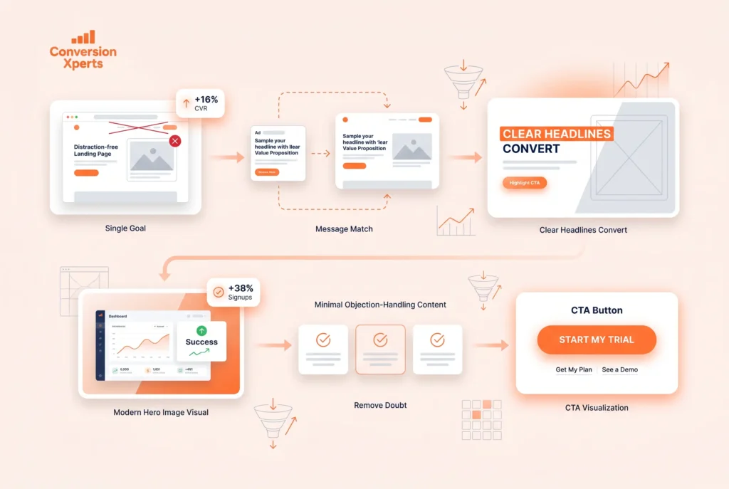
Step 1: Define the One Thing
Every high-converting landing page is built around one thing: one audience, one problem, one solution, one call to action. The moment you add a second CTA, a navigation bar, or content that distracts from the primary offer, conversion rate drops.
Unbounce’s 2024 Conversion Benchmark Report analyzed over 44,000 landing pages and found that removing navigation from landing pages increased conversions by an average of 16%. When visitors cannot navigate away, they are forced to either engage with the offer or leave. Eliminating the easy exits makes the path to conversion the path of least resistance.
Step 2: Build a Message-Match Foundation
Message match is the degree of continuity between the ad, email, or link a visitor clicked and the landing page they arrived on. When a visitor clicks an ad that says “Get 50% Off Your First Order” and lands on a homepage that makes no mention of that offer, cognitive dissonance immediately creates distrust.
Every landing page should mirror the headline, offer, and visual tone of the traffic source that feeds it. If you are running multiple ad variations, consider building a dedicated landing page for each major variation. This level of personalization consistently produces double-digit conversion rate improvements.
Step 3: Write a Headline That Converts
The headline is the single most important element on any landing page. It determines whether visitors read the next line or leave. A great landing page headline makes a specific promise to a specific person about a specific outcome.
The four most effective headline formulas for landing pages are the outcome headline (“Double Your Email List in 30 Days”), the problem-solution headline (“Stop Losing Customers to Slow Page Speeds”), the how-to headline (“How to Cut Your Ad Spend by 40% Without Losing Leads”), and the question headline (“Are You Making These 7 Checkout Mistakes?”).
Each of these formulas works because it immediately signals relevance and creates a reason to keep reading. Avoid clever wordplay in headlines unless your brand has already established strong awareness. Clarity of benefit always outperforms creative ambiguity in conversion tests.
Step 4: Use a Hero Image That Shows the Outcome
The hero image positioned beside or below the headline should visually reinforce the transformation your product or service delivers. Showing the outcome rather than the product consistently outperforms product shots in A/B tests.
For software products, showing the interface in a context of success, such as a dashboard displaying positive metrics, outperforms showing the login screen. For service businesses, showing a happy client or a completed transformation outperforms showing the service provider at their desk. For physical products, showing the product being used in a relevant lifestyle context outperforms isolated product photography.
A 2023 VWO case study documented a 38% increase in trial signups for a SaaS company after replacing a generic stock photo of a businessman with a screenshot of the software showing a clean, positive outcome dashboard.
Step 5: Build the Body Around Objections
After the headline captures attention, the body of the landing page must systematically address every objection standing between the visitor and the conversion. Structure the body content in order of objection priority, starting with the most common or most significant hesitation.
Use subheadings to break the page into scannable sections. Because most visitors scan before they read, your subheadings must carry the essential argument even if the body copy is never fully read. A visitor who only reads your headline and three subheadings should still walk away with a clear understanding of the primary benefit and the main reason to act now.
Step 6: Optimize Your CTA Button
The CTA button is where all your persuasion efforts converge into a single action. It deserves more testing attention than almost any other page element.
Button copy that uses first-person language and reinforces the specific benefit converts better than generic verbs. “Start My Free Trial” outperforms “Start Free Trial.” “Get My Custom Plan” outperforms “Get Started.” “Yes, I Want More Leads” outperforms “Submit.” These differences may seem minor but they are consistently validated by A/B tests across industries.
Button color should create high contrast with the surrounding background. There is no universally best button color because the right color depends entirely on your page’s color scheme. The rule is contrast, not a specific hue. A bright orange button on a white background with blue text will outperform a muted gray button every time.
Button size should be large enough to command attention without looking desperate. Place the primary CTA above the fold and repeat it after each major section on long-form landing pages.
Website Conversion Rate Tips for Product and Service Pages
Product and service pages sit in the middle of the funnel where visitors have already demonstrated interest and are now evaluating whether your specific offer is the right choice. These pages must combine information, social proof, and persuasion in a precise balance.
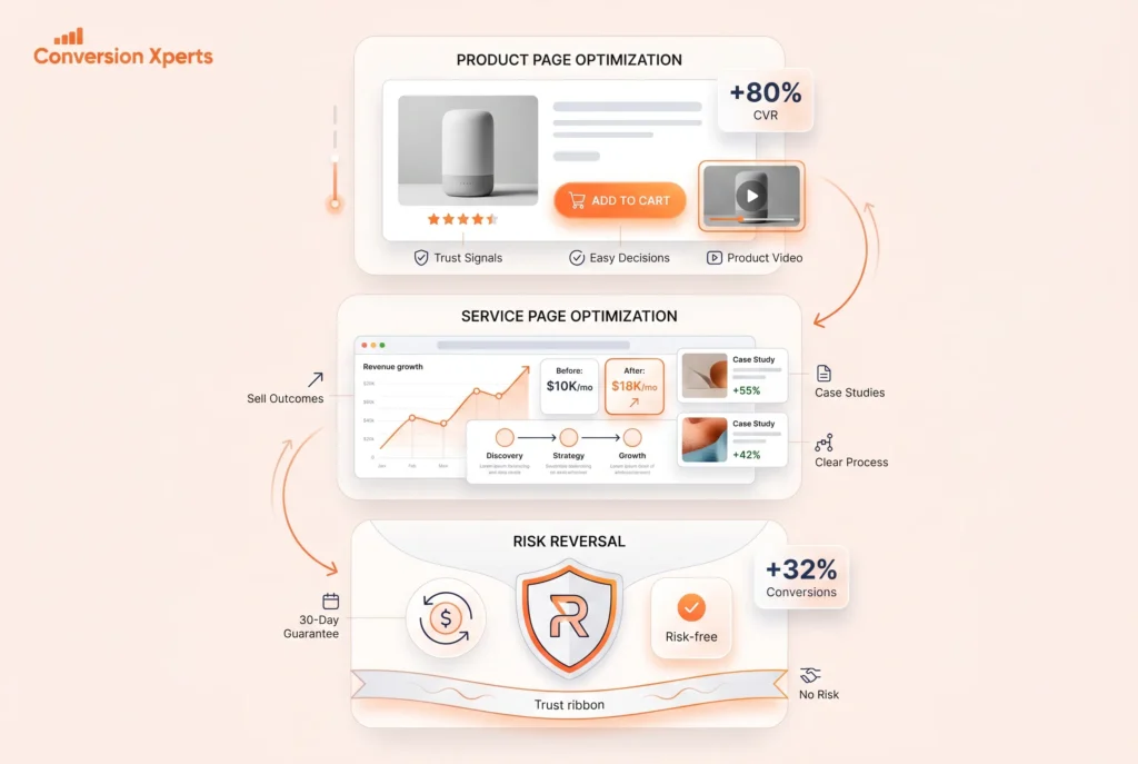
For Product Pages: Make the Decision Easy
The goal of a product page is to give the visitor every piece of information they need to make a confident purchase decision without overwhelming them with information they do not need.
Lead with the most purchase-critical information: the product name, the primary benefit, the price, and the key differentiator. Follow with supporting details, specifications, and trust elements. Reserve secondary information like detailed specifications, shipping policies, and warranty details for expandable sections or tabs so they are available without cluttering the primary conversion path.
Product videos increase conversion rates by an average of 80% according to Wyzowl’s 2024 report. Even a short 60-second demonstration video showing the product in use builds more purchase confidence than any amount of written description because it answers the “does this actually work” question that sits in the back of every buyer’s mind.
For Service Pages: Sell the Outcome First
Service pages suffer from a specific conversion problem: services are intangible, which makes them inherently harder to evaluate than physical products. Visitors cannot touch, try, or visualize a service before buying it.
The solution is to make the outcome as tangible as possible. Use specific numbers wherever available: “Our clients see an average of 40% revenue increase in the first six months.” Use before-and-after case studies with specific metrics. Use process visuals that show exactly what working with you looks like step by step, removing the uncertainty about what happens after someone signs up.
Pricing transparency on service pages is a significant conversion factor. According to a 2024 HubSpot research study, service business websites that display pricing information receive 47% more qualified leads than those that hide pricing behind a contact form. Visitors who self-qualify against pricing submit higher-quality inquiries and convert to paying clients at a higher rate.
Risk Reversal Removes the Final Barrier
The final purchase barrier for most visitors is fear of making a mistake. A money-back guarantee, a free trial, a free consultation, or a results guarantee directly addresses this fear by transferring the risk from the buyer to the seller.
Risk reversal is most effective when it is specific, prominently displayed, and written in plain language. “30-Day Money-Back Guarantee, No Questions Asked” is clear and confident. “Our 100% Satisfaction Promise: If you are not completely satisfied within 30 days, we will refund every penny” is even more specific and reassuring.
A 2023 CXL Institute study found that adding a prominent money-back guarantee to a product page increased conversions by 32% with no corresponding increase in refund rates. The perceived risk reduction far outweighed the actual risk taken on.
How to Improve Checkout Conversion Rate
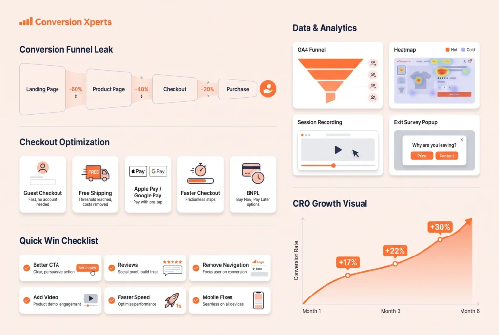
For ecommerce businesses, the checkout page is where the most money is lost. With an average abandonment rate of 70.19% according to the Baymard Institute’s 2024 data, checkout optimization represents the single largest untapped revenue opportunity for most online stores.
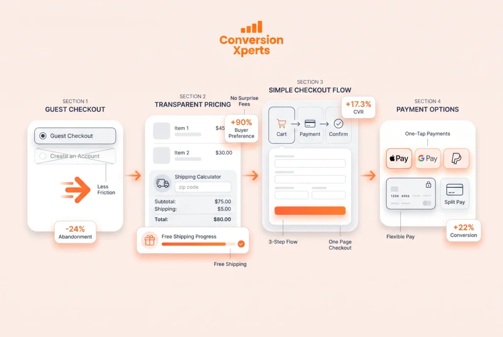
Enable Guest Checkout Without Friction
Requiring account creation before purchase is the number one checkout conversion killer. The Baymard Institute found that 24% of US adults have abandoned a purchase specifically because they were required to create an account.
Enable guest checkout as the primary and most visible option. If you want to convert guests to account holders, prompt them to create an account after the purchase is complete, when they are happy and the transaction is confirmed. Post-purchase account creation rates are significantly higher than pre-purchase requirements because the resistance to the brand has been eliminated.
Show Total Costs Early
Unexpected costs at checkout, including shipping fees, taxes, and handling charges, are the single most commonly cited reason for cart abandonment. The Baymard Institute’s 2024 survey found that 48% of abandoning shoppers cited unexpected extra costs as the primary reason they left.
Display total estimated costs including shipping and taxes as early as possible in the shopping experience. Show a shipping cost calculator on the cart page. Offer free shipping at a clearly communicated threshold (“Add $15 more for free shipping”) because free shipping is one of the most powerful purchase motivators in ecommerce.
A 2024 Walker Sands Future of Retail survey found that 90% of consumers said free shipping was their top incentive for shopping online more frequently.
Reduce Checkout Steps to the Minimum
Every additional step in a checkout flow reduces completion probability. Audit your checkout from cart to confirmation and eliminate every step, page, field, and confirmation click that is not strictly necessary to complete the transaction.
The ideal checkout has three stages: cart review, payment and shipping information, and order confirmation. Any checkout requiring more than three pages should be audited for unnecessary complexity.
One-page checkouts, where all information is collected on a single scrollable page, consistently outperform multi-page checkouts for stores with simple product configurations. According to Shopify’s 2024 Checkout Optimization Report, one-page checkout increased conversion rates by 17.3% across their merchant base when compared to the previous three-page checkout.
Offer Multiple Payment Methods
Payment method friction is an invisible conversion killer. When a visitor’s preferred payment method is unavailable, many will abandon rather than enter unfamiliar payment information.
At minimum, offer major credit and debit cards, PayPal, and where available, Apple Pay and Google Pay. Shopify’s 2024 data shows that enabling accelerated checkout options like Shop Pay, Apple Pay, and Google Pay increases checkout conversion by an average of 9%.
Buy-now-pay-later options such as Klarna, Afterpay, and Affirm have become particularly important for higher-ticket items. A 2024 Klarna merchant data report found that adding BNPL options increased average order value by 41% and conversion rates by 22% on eligible products.
Using Data to Find and Fix Conversion Leaks
Improving your website’s conversion rate without data is like trying to repair a leaking pipe by randomly replacing fittings. You need to know exactly where the leak is before you can fix it efficiently.
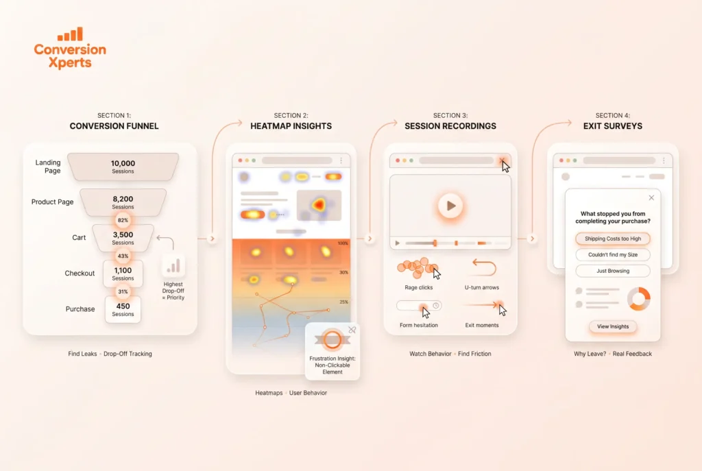
Build a Conversion Funnel in Google Analytics 4
A conversion funnel maps the sequence of pages or events visitors go through on their path to completing a conversion. In Google Analytics 4, use the Funnel Exploration report to visualize exactly where visitors drop off.
Build separate funnels for your most important conversion paths. For an ecommerce store, the core funnel is typically: landing page, product page, add to cart, checkout initiation, payment information, and order confirmation. For a SaaS company, it might be: homepage, features page, pricing page, and trial signup. For a service business: homepage, service page, contact page, and form submission.
The funnel visualization will immediately show you the step with the highest drop-off rate. That step is your highest-priority conversion optimization opportunity. Fix the biggest leak first before addressing smaller ones.
Heatmaps Reveal What Numbers Cannot
Analytics data tells you that 70% of visitors leave a particular page. Heatmaps tell you why. Click heatmaps show where visitors are clicking, including clicks on non-clickable elements that signal unmet expectations. Scroll maps show how far visitors read before leaving. Move maps show how visitors’ cursors travel, which correlates with reading patterns.
The most common heatmap insight that improves conversion rates is discovering that visitors are clicking on something that is not a link, such as an icon, an image, or a subheading. This behavior signals an information gap. The visitor wants more detail on that element and is not finding it. Adding a link or expanding the content in that area consistently improves engagement and conversion.
Microsoft Clarity is a free tool that provides both heatmaps and session recordings with no data limits. For higher-traffic sites, Hotjar’s paid plans offer more sophisticated filtering and segmentation options.
Session Recordings Capture the Invisible Moment
Session recordings are video replays of actual visitor sessions. Watching real visitors navigate your website for just two hours typically surfaces more conversion insights than weeks of quantitative analysis.
When watching session recordings, look for rage clicks, which are rapid repeated clicks on a single element and indicate frustration. Look for U-turns, where visitors navigate forward and then immediately back, indicating they reached a page that did not meet their expectation. Look for form abandonment patterns that reveal which specific fields cause the most hesitation. And look for exit patterns that reveal which page element was being viewed when visitors decided to leave.
Run Exit Intent Surveys
Exit intent surveys trigger a popup when a visitor’s cursor moves toward the browser bar or back button, indicating they are about to leave. These surveys ask the visitor directly why they are leaving, generating qualitative data that no behavioral tracking tool can provide.
Keep exit surveys to a single question to maximize response rates. The most valuable questions are “What stopped you from completing your purchase today?”, “What information were you looking for that you could not find?”, and “What would make you more likely to sign up?” Even a 5% response rate on an exit survey generates enough qualitative insight to fuel months of conversion optimization testing.
Quick Win Checklist: 30 Website Conversion Rate Tips
These are the highest-impact conversion improvements you can make, organized by implementation difficulty. Start from the top and work down.
Immediate Fixes (No Developer Required)
One: Rewrite your homepage headline to focus on the specific outcome you deliver, not what your product does.
Two: Change your primary CTA button copy from a generic verb to first-person benefit language.
Three: Add your aggregate customer review rating to your homepage above the fold.
Four: Add a specific money-back guarantee or free trial offer to your highest-traffic product or service page.
Five: Remove navigation from your most important landing pages.
Six: Add specific client or customer counts to your homepage trust section.
Seven: Replace stock photography with real images of your team, customers, or product in use.
Eight: Add urgency to your primary offer using a legitimate deadline or scarcity indicator.
Nine: Add an FAQ section to your product or service pages addressing the three most common pre-purchase questions.
Ten: Ensure your primary CTA button color creates high contrast with its surrounding background.
Short-Term Improvements (Minor Developer Help)
Eleven: Implement exit-intent popups with a single-question survey or a compelling last-chance offer.
Twelve: Add a live chat or chatbot widget to your highest-traffic pages and measure its impact on conversion rates.
Thirteen: Reduce your primary lead capture form to three fields or fewer.
Fourteen: Add trust badges, SSL indicators, and payment method icons near your checkout or signup button.
Fifteen: Implement a cart abandonment email sequence with at least three emails.
Sixteen: Add a progress bar to any multi-step form or checkout flow.
Seventeen: Create a dedicated landing page for your highest-volume paid search campaign with full message match.
Eighteen: Add video testimonials or demonstration videos to your product and service pages.
Nineteen: Enable guest checkout if your ecommerce store currently requires account creation.
Twenty: Add Apple Pay, Google Pay, and at least one buy-now-pay-later option to your checkout.
Strategic Improvements (Require Planning and Development)
Twenty-one: Set up conversion funnel tracking in Google Analytics 4 for your three most important conversion paths.
Twenty-two: Install Microsoft Clarity or Hotjar and spend two hours per week watching session recordings.
Twenty-three: Run your first A/B test on your homepage headline with a properly calculated sample size.
Twenty-four: Conduct a customer survey asking “what almost stopped you from signing up or buying?”
Twenty-five: Build separate landing pages for each major audience segment or traffic source.
Twenty-six: Implement personalization to show different homepage messages to returning visitors versus first-time visitors.
Twenty-seven: Conduct a full mobile usability audit on your three highest-traffic pages and fix every tap target, font size, and layout issue you find.
Twenty-eight: Run a page speed audit using Google PageSpeed Insights and implement all “opportunities” flagged as high impact.
Twenty-nine: Create a retargeting campaign specifically for cart abandoners and landing page visitors who did not convert.
Thirty: Establish a monthly CRO review process where you analyze test results, document learnings, and plan the next testing cycle.
Comparison Table: Before and After CRO Fixes
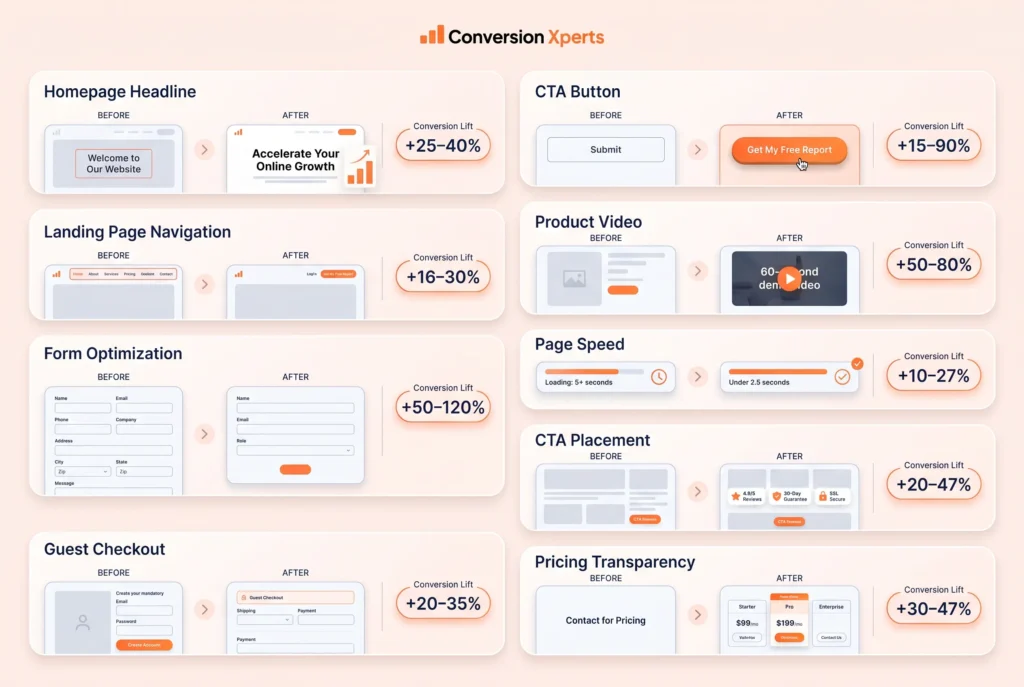
| Page Element | Before Optimization | After Optimization | Average Conversion Lift |
Homepage headline | “Welcome to Our Website” | Specific benefit-driven outcome headline | 25 to 40% |
CTA button copy | “Submit” or “Click Here” | First-person benefit: “Get My Free Report” | 15 to 90% |
Navigation on landing page | Full site navigation visible | Navigation removed entirely | 16 to 30% |
Form fields | 10 or more fields | 3 to 4 fields | 50 to 120% |
Checkout: guest option | Account creation required | Guest checkout as primary option | 20 to 35% |
Product page: video | No video | 60-second demonstration video | 50 to 80% |
Trust signals | None visible | Guarantee, reviews, badges above fold | 20 to 34% |
Page load time | 5 or more seconds | Under 2.5 seconds | 10 to 27% |
CTA placement | One CTA at bottom of page | CTA above fold and repeated throughout | 20 to 47% |
Pricing transparency | Hidden behind contact form | Pricing ranges displayed clearly | 30 to 47% |