CRO Best Practices: The Complete Guide to Converting More Visitors Into Customers
- Published by: Kamran
- Last Updated: July 2026
Conversion rate optimization, often shortened to CRO, is the practice of increasing the percentage of website visitors who complete a desired action. That action might be making a purchase, filling out a form, signing up for a newsletter, booking a demo, or clicking a specific button. Rather than focusing purely on driving more traffic, CRO focuses on getting more value out of the traffic you already have.
This distinction matters more than most marketers realize. Paid traffic gets expensive every year. Organic traffic takes months to build. But improving your conversion rate from two percent to four percent effectively doubles your results without spending an extra dollar on acquisition. That is why CRO has become one of the highest leverage activities in digital marketing.
This guide walks through the best practices that separate high performing websites from the rest, covering research, testing, copywriting, design, technical performance, and the internal processes needed to sustain long term growth.
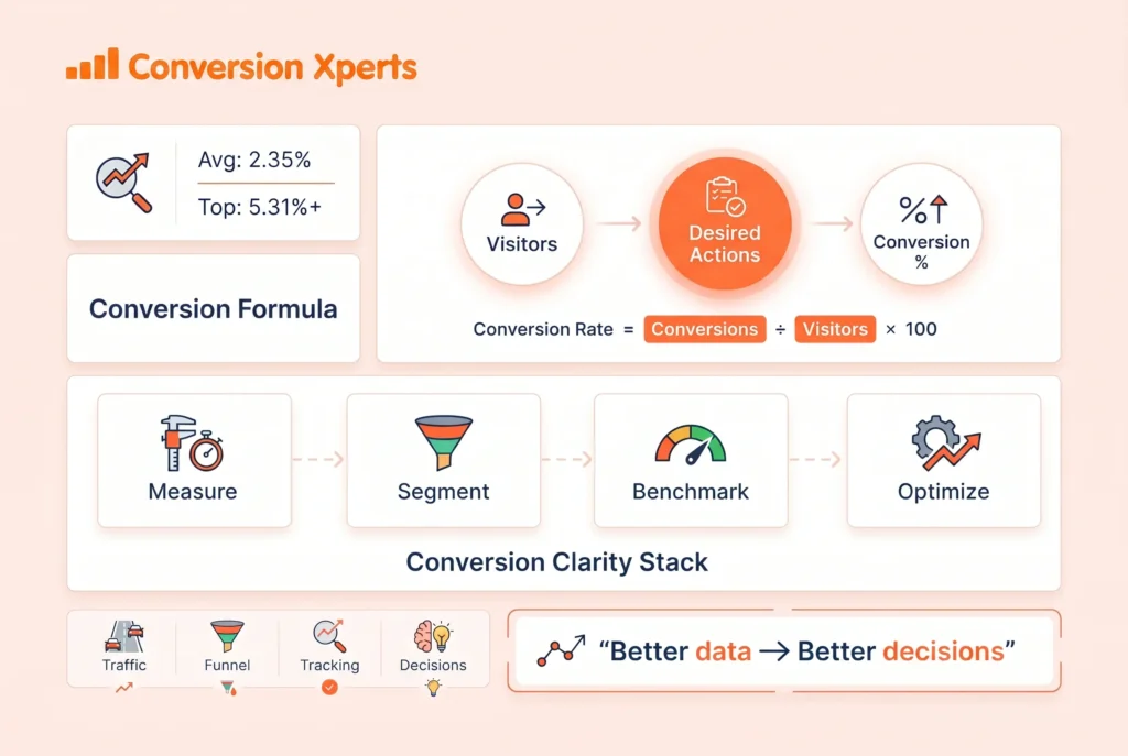
What Conversion Rate Optimization Actually Means
At its core, CRO is a cycle of observation, hypothesis, testing, and iteration. You look at how people actually behave on your site, you form theories about why they are not converting, you test changes based on those theories, and you measure the results. Then you repeat the process.
A conversion does not always mean a sale. Depending on your business model, a conversion could be:
A completed checkout on an ecommerce store A submitted lead form on a service business site A free trial signup for a software product A newsletter subscription on a content site A phone call initiated from a landing page A demo booking on a B2B website
Every business should define its primary and secondary conversion goals clearly before optimization work begins. Without a clear goal, it becomes impossible to know whether a change actually improved performance or simply moved metrics around.
For a deeper look at how conversion goals map to funnel stages, see our guide on building a conversion funnel from scratch.
Why CRO Deserves a Bigger Budget Than You Think
Many companies pour their entire marketing budget into acquisition channels like paid search, paid social, and SEO, while spending almost nothing on what happens after the click. This is a mistake for a few reasons.
First, acquisition costs are rising across almost every channel. Google Ads, Meta Ads, and LinkedIn Ads have all become more competitive and more expensive over the past several years, according to reporting from Think with Google on evolving customer behavior and rising expectations around speed and relevance. Getting more out of existing traffic is often cheaper than acquiring new traffic.
Second, CRO improvements compound. A five percent lift in conversion rate applies to all future traffic, not just a single campaign. This makes CRO one of the few marketing activities with a genuinely compounding return.
Third, the insights gained from CRO research often improve other parts of the business. Understanding why customers hesitate at checkout might reveal a pricing problem. Understanding why visitors bounce from a landing page might reveal a messaging problem that affects sales conversations too.
Building the Research Foundation Before You Test Anything
The biggest mistake in CRO is jumping straight to testing without first understanding user behavior. Random testing based on guesses, sometimes called “spray and pray” testing, wastes time and often produces misleading results.
Start With Quantitative Data
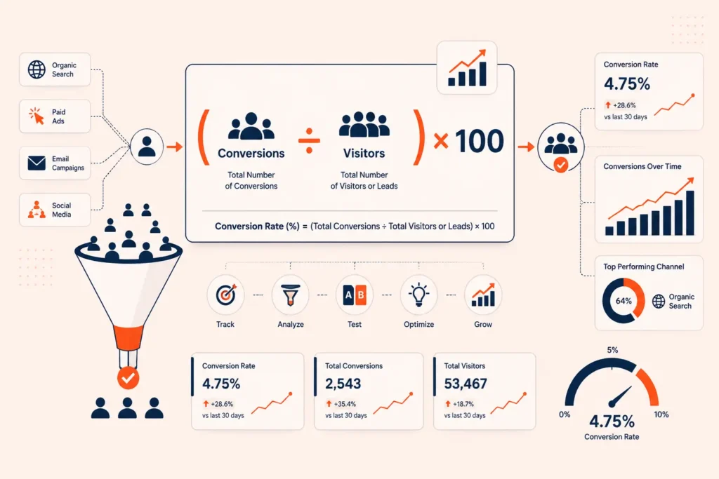
Your analytics platform, whether that is Google Analytics 4, Mixpanel, or another tool, should be the starting point. Look at:
Conversion rates by traffic source, device type, and landing page Drop off points in your funnel where users leave before converting Pages with high traffic but low conversion, which represent your biggest opportunity Bounce rate and time on page for key landing pages Cart abandonment rate for ecommerce sites
The goal here is to find where the biggest leaks are happening. A checkout page with a sixty percent abandonment rate and high traffic volume is a much better place to focus than a low traffic blog page with a mediocre conversion rate.
Layer in Qualitative Data
Numbers tell you what is happening, but they rarely tell you why. This is where qualitative research becomes essential.
Heatmaps and click maps, available through tools like Hotjar or Microsoft Clarity, show you where visitors are actually clicking, scrolling, and spending attention. If a critical call to action sits below the point where most visitors stop scrolling, that is a clear problem to fix.
Session recordings let you watch anonymized replays of real visitor sessions. These often reveal confusing navigation, broken elements, or hesitation points that numbers alone cannot show.
On site surveys and exit intent polls ask visitors directly why they did not complete a purchase or sign up. A simple question like “what almost stopped you from buying today” can surface objections you never considered.
User testing platforms let you watch real people attempt tasks on your site while narrating their thoughts aloud. The Nielsen Norman Group, one of the most respected authorities in user experience research, has published extensively on how even a small number of usability tests can uncover the majority of a website’s most significant usability problems.
Talk to Real Customers and Support Teams
Sales calls, support tickets, and live chat transcripts are an underused goldmine for CRO. Customers often explain their hesitations and objections in their own words during these conversations. Reviewing a sample of recent support tickets or sales call recordings can reveal recurring friction points that never show up in a spreadsheet.
Landing Page Optimization Best Practices
Landing pages are often the first true test of whether your value proposition resonates with a visitor. A poorly optimized landing page can waste every dollar spent on acquisition.
Match Message to Intent
The single most important principle in landing page design is message match. If a visitor clicks an ad promising “fifty percent off running shoes,” the landing page headline should immediately confirm that offer. Any mismatch between what was promised and what is delivered increases bounce rate immediately.
Keep the Value Proposition Above the Fold
Visitors should understand what you offer, who it is for, and why it matters within a few seconds of landing on the page. This does not mean cramming everything into the first screen. It means the headline and subheadline should clearly communicate the core benefit without requiring scrolling.
Reduce Choice and Cognitive Load
Every extra option, navigation link, or distraction on a landing page gives visitors a reason to leave without converting. High converting landing pages typically remove the main site navigation entirely and focus attention on a single primary action. This concept, sometimes called the attention ratio, refers to the number of things a visitor can do on a page compared to the number of things you actually want them to do.
Use Real, Specific Copy Instead of Generic Claims
“Trusted by thousands” is weaker than “Trusted by 14,200 small business owners since 2019.” Specificity builds credibility because vague claims read as marketing fluff while precise numbers feel factual and earned. This principle applies across headlines, testimonials, and feature descriptions.
For more detail on writing landing pages that convert, check our internal resource on landing page copywriting frameworks.
Call to Action Optimization
The call to action, or CTA, is often the single element tested most frequently in CRO programs, and for good reason. Small changes here can produce outsized results.
Use Action Oriented, Specific Language
Generic CTAs like “Submit” or “Click Here” underperform compared to specific, benefit driven language like “Start My Free Trial” or “Get My Custom Quote.” The CTA should describe what happens next or what the visitor gains, not just the mechanical action of clicking.
Reduce First Person Friction
Some tests have shown that switching CTA language from second person (“Start Your Trial”) to first person (“Start My Trial”) increases clicks, since the phrasing mirrors how a visitor might think internally about the decision. This is worth testing on your own site rather than assuming universal results, since audience behavior varies.
Make CTAs Visually Distinct
Buttons should stand out clearly from surrounding content through color contrast, whitespace, and size. However, distinct does not mean garish. The color should align with your brand while still drawing the eye. Testing button color in isolation, without changing copy or placement, is one of the lowest effort experiments a team can run.
Place CTAs at Natural Decision Points
Rather than relying on a single CTA at the very top or bottom of a page, effective pages repeat the CTA at multiple natural points, particularly after sections that address objections or build trust.
Trust Signals and Social Proof
People rarely convert based on logic alone. They convert when logic and trust align. Building visible trust signals throughout your site is one of the most reliable CRO levers available.
Types of Trust Signals to Include
Customer reviews and star ratings displayed near product information Case studies with measurable outcomes and named companies where possible Security badges near payment forms, particularly for ecommerce checkouts Media mentions or “as seen in” logos from recognized publications Money back guarantees or free return policies stated clearly Specific, attributed testimonials rather than anonymous quotes
The Baymard Institute, a research organization focused on ecommerce usability, has published large scale studies showing that unclear return policies and hidden costs are among the top reasons shoppers abandon carts during checkout. Addressing these concerns transparently, before the visitor has to ask, consistently improves completion rates.
Reduce Perceived Risk
Every purchase decision involves some level of perceived risk, whether financial, social, or functional. Reducing that risk through guarantees, free trials, transparent pricing, and clear cancellation policies removes a major psychological barrier to conversion.
Copywriting Principles That Drive Conversion
Words matter as much as design, and often more. A beautifully designed page with weak copy will still underperform.
Lead With Benefits, Support With Features
Visitors care less about what a product does technically and more about what it means for them. A feature like “256 bit encryption” should be paired with the benefit “your data stays completely private,” so visitors immediately understand the relevance.
Address Objections Before They Arise
Every product or service has common objections. Price concerns, time commitment, learning curve, and trust in the company are frequent examples. Proactively addressing these within your copy, rather than waiting for the visitor to hunt for an FAQ section, reduces hesitation and abandonment.
Write for Scanners, Not Just Readers
Most visitors scan a page before deciding whether to read it in full. Short paragraphs, descriptive subheadings, bullet points, and bold key phrases all help scanning visitors quickly grasp your core message. This is also increasingly important for how large language models and AI search tools parse and summarize web content, since clear structural organization makes it easier for these systems to extract accurate information about your offering.
Avoid Jargon and Internal Language
Terms that make sense internally at your company often confuse outside visitors. Clear, plain language almost always outperforms clever or industry specific phrasing, particularly on pages meant to convert first time visitors.
Form and Checkout Optimization
Forms are frequently the final barrier between interest and conversion, which makes them one of the highest impact areas for CRO work.
Reduce the Number of Fields
Every additional form field increases the likelihood of abandonment. Research from multiple usability studies has consistently found that shorter forms outperform longer ones, particularly for top of funnel actions like newsletter signups or free trial requests. Ask only for information you genuinely need at this stage of the relationship.
Use Inline Validation
Showing errors immediately as a user types, rather than only after they submit the form, reduces frustration and abandonment. Clear, specific error messages such as “please enter a valid email address” perform better than generic messages like “invalid input.”
Offer Guest Checkout for Ecommerce
Forcing account creation before purchase is one of the most consistently cited reasons for cart abandonment in ecommerce usability research. Offering a guest checkout option, with account creation offered afterward, removes unnecessary friction at the exact moment a customer is ready to buy.
Show Progress on Multi Step Forms
If a form or checkout process requires multiple steps, a visible progress indicator helps set expectations and reduces the perceived effort required, which in turn reduces drop off.
Technical Performance and Mobile Optimization
No amount of copywriting or design work matters if the page loads too slowly or breaks on mobile devices.
Page Speed Is a Conversion Factor, Not Just an SEO Factor
Google’s own research on page speed has found that as load time increases from one second to five seconds, the probability of a mobile visitor bouncing increases dramatically. Every additional second of load time is a direct threat to your conversion rate, independent of any other optimization work.
Practical steps to improve speed include compressing images, minimizing unnecessary scripts and third party tags, using a content delivery network, and enabling browser caching. Tools like Google PageSpeed Insights and GTmetrix can identify specific technical bottlenecks on your site.
Design Mobile First, Not Mobile Adjusted
With mobile traffic making up the majority of visits for most websites today, designing for mobile as an afterthought is no longer viable. Buttons need to be large enough for thumbs, text needs to be legible without zooming, and forms need to minimize typing wherever possible, using features like autofill and numeric keypads for phone or postal code fields.
Test Across Real Devices
Emulators and browser tools are useful but do not always catch every issue. Periodically testing on actual mobile devices, across different operating systems and screen sizes, catches problems that would otherwise go unnoticed until they start affecting real conversion rates.
A/B Testing and Experimentation Best Practices
Testing is where CRO moves from theory into measurable proof. But testing done poorly can produce false confidence in the wrong changes.
Test One Meaningful Variable at a Time
While multivariate testing exists for testing multiple elements simultaneously, most teams get more reliable, easier to interpret results from classic A/B tests that isolate a single meaningful change, such as headline, CTA copy, or layout structure.
Ensure Statistical Significance Before Concluding
Ending a test early because one variant appears to be “winning” is one of the most common CRO mistakes. Tests need enough traffic and conversions to reach statistical significance, typically ninety five percent confidence or higher, before conclusions should be trusted. CXL, a well known authority in experimentation and testing methodology, has published extensively on how premature test conclusions lead teams to implement changes that produce no real long term benefit.
Account for Business Cycles
Running a test for only a few days can produce misleading results if your traffic or conversion behavior varies by day of week or time of month. Most CRO practitioners recommend running tests for at least one to two full business cycles, often two to four weeks, to account for this variation.
Document Every Test, Win or Lose
A failed test still produces valuable information. Keeping a documented record of hypotheses, results, and learnings prevents teams from repeating the same failed experiments and builds institutional knowledge over time. This documentation becomes especially valuable as team members change over the years.
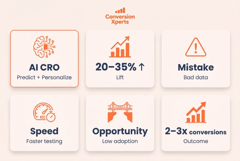
Personalization as an Advanced CRO Lever
Once foundational CRO practices are in place, personalization offers another layer of improvement. This involves tailoring content, offers, or messaging based on visitor characteristics such as location, referral source, past behavior, or account status.
Examples include showing returning visitors different messaging than first time visitors, adjusting currency and language automatically based on location, or displaying different case studies depending on which industry a visitor appears to represent based on their referral source.
Personalization should be layered on top of a strong baseline experience rather than used to compensate for a fundamentally weak page. Teams that jump to advanced personalization before fixing basic usability issues often see disappointing results, since the underlying friction points remain unaddressed.
Common CRO Mistakes to Avoid
Even experienced teams fall into predictable traps. Being aware of these can save significant time and resources.
Testing without a clear hypothesis, which leads to random changes and unclear learnings Ending tests too early before reaching statistical significance Focusing only on the homepage while ignoring high traffic landing pages or checkout flows Ignoring mobile experience despite it representing the majority of traffic for most sites Copying “best practices” from other companies without testing whether they apply to your specific audience Optimizing for micro conversions like clicks while ignoring whether they actually lead to macro conversions like revenue Treating CRO as a one time project rather than an ongoing process
Building a Sustainable CRO Process
The companies that see the biggest long term gains from CRO treat it as an ongoing discipline rather than a short term project. This typically involves a few structural elements.
A dedicated owner or small team responsible for the CRO roadmap, even if that responsibility is shared across marketing, product, and design.
A regular cadence of testing, often reviewed weekly or biweekly, so momentum does not stall between experiments.
A shared research repository where heatmaps, survey responses, session recordings, and past test results are stored and easily searchable by the whole team.
Cross functional collaboration between marketing, design, engineering, and customer support, since insights relevant to conversion often surface outside the marketing team.
Clear success metrics tied to business outcomes, not just vanity metrics like click through rate, ensuring that optimization work is actually improving revenue or qualified leads rather than just surface level engagement.
Tools Commonly Used in CRO Programs
While tools alone do not create good CRO outcomes, the right stack makes research and testing significantly more efficient.
Analytics platforms such as Google Analytics 4 for quantitative funnel data Heatmap and session recording tools such as Hotjar or Microsoft Clarity A/B testing platforms such as Optimizely, VWO, or Google Optimize alternatives Survey and feedback tools for collecting direct visitor input Page speed testing tools such as Google PageSpeed Insights Form analytics tools to identify specific fields causing drop off
For a deeper comparison of specific CRO tools and which ones fit different budget levels, see our internal breakdown of the best conversion optimization software for small teams.
Bringing It All Together
Conversion rate optimization is not a single tactic but a discipline built from research, testing, and continuous refinement. The businesses that treat it seriously do not chase trends or copy competitor pages blindly. Instead they build a repeatable process rooted in real user data, they test methodically rather than randomly, and they treat every visitor interaction as an opportunity to learn something new about their audience.
Start with the fundamentals. Understand where visitors are dropping off using analytics. Layer in qualitative research through heatmaps, session recordings, and direct customer feedback. Optimize landing pages for message match and clarity. Strengthen your calls to action and trust signals. Reduce friction in forms and checkout flows. Make sure your site performs well technically, particularly on mobile. Then build a sustainable testing culture that keeps improving over time rather than stopping after a single successful experiment.
CRO rewards patience and rigor over shortcuts. The compounding nature of even small conversion improvements means that the work you put in today continues paying dividends across every future visitor your marketing brings to the site.
I'm Kamran Mushtaq, founder of Conversion Xperts and a CRO specialist who helps brands grow revenue from the traffic they already have, without spending more on ads. For nearly a decade I've lived in the data: studying how visitors move through a site, where they hesitate, and what finally convinces them to act.I work across four areas:Ecommerce CRO: turning more store visitors into buyers through optimized product pages, checkout flows, and full funnels Lead generation: lifting form fills, demo requests, and qualified inquiries on service and local sites B2B conversion: shortening the path from visit to inquiry for considered, high-value purchases SaaS conversion: improving signups, trial starts, and free-to-paid activationMy approach pairs rigorous analytics with genuine customer empathy. Using Google Analytics 4, Hotjar, and Google Tag Manager, I uncover the "why" behind conversion drop-offs, then run structured A/B experiments to fix them. Every recommendation is grounded in evidence, not intuition.To date I've delivered 300+ CRO audits and run thousands of A/B tests across ecommerce, B2B, SaaS, and lead generation. From a single product page to a full funnel rebuild, the goal never changes: make every visit count.