Turning high-intent shoppers into more purchases through CRO research, stronger social proof, clearer product benefits, free-shipping messaging, and a smoother shopping experience.
$8.6M+
REVENUE ADDED
16
TESTS WON
21
TESTS RAN
The majority of our A/B Tests ran for approximately 2 weeks.
We improved product discovery by making key navigation and browsing elements more prominent.
Trust and purchase confidence were strengthened through clearer availability and product-focused messaging.
High-intent areas were optimized with stronger visual hierarchy and easier access to important actions.
Each test aimed to remove friction, improve the shopping journey, and drive more completed purchases.
First Test
RESULTS
CVR Increased:
+11.69%
Monthly Revenue:
+$28,454
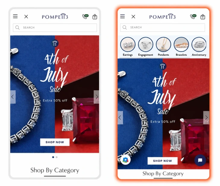
Adding Collection Thumbnails Above the Homepage Banner
The original mobile homepage led shoppers directly into the promotional banner. The variation added visual collection shortcuts above the banner, giving visitors immediate access to popular jewelry categories such as earrings, engagement rings, pendants, and bracelets.
Why This Test Won
Faster product discovery: shoppers could jump directly to the category they were interested in.
Improved mobile navigation: visual collection links made browsing easier without relying on the main menu.
Better use of high-visibility space: placing key categories near the top of the page exposed more shopping options earlier in the journey.
What We Learned
Giving mobile visitors quick access to popular collections can simplify navigation and help them reach relevant products with fewer steps.
Conclusion
The winning variation showed that introducing visual category shortcuts above the hero banner can improve product discovery and create a more efficient mobile shopping experience.
Second Test
RESULTS
CVR Increased:
+7.09%
Monthly Revenue:
+$42,929
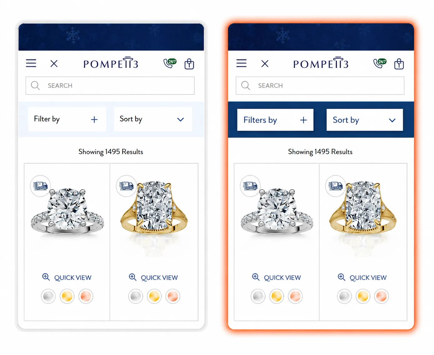
Improving Filter and Sort Visibility
The original collection page used a light background around the filter and sort controls, which made them blend into the surrounding layout. The variation introduced a stronger branded background with subtle shadows around both controls, making these shopping tools easier to notice and interact with.
Why This Test Won
Increased control visibility: stronger contrast helped the filter and sort options stand out immediately.
Improved visual hierarchy the updated styling clearly separated browsing controls from the product results.
Made product discovery easier: more noticeable controls encouraged shoppers to refine a large product selection more efficiently.
What We Learned
Small visual improvements to key browsing tools can make collection pages easier to navigate, especially when shoppers have a large number of products to explore.
Conclusion
The winning variation showed that emphasizing filter and sort controls can create a clearer browsing experience and help shoppers find relevant products faster.
Third Test
RESULTS
CVR Increased:
+7.30%
Monthly Revenue:
+$73,580
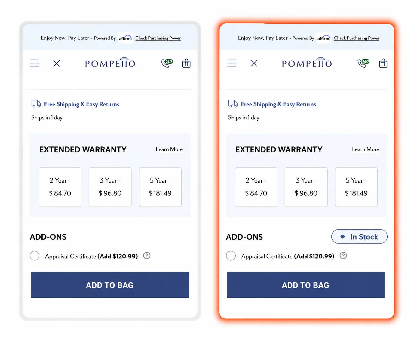
Making Product Availability More Visible
The original product page did not clearly communicate stock status near the purchase area. The variation added a prominent “In Stock” indicator above the Add to Bag button, giving shoppers immediate confirmation that the item was available to purchase.
Why This Test Won
Added purchase reassurance: clear availability messaging confirmed that the product was ready to order.
Reduced uncertainty: shoppers no longer had to question whether the selected item was currently available.
Strengthened the purchase area: positioning stock status close to the Add to Bag button supported the final buying decision.
What We Learned
Displaying availability at the right moment can give shoppers extra confidence and remove unnecessary hesitation before adding a product to their cart.
Conclusion
The winning variation showed that making stock status visible near the primary purchase action can create a more reassuring experience and support stronger purchase intent.
Fourth Test
RESULTS
CVR Increased:
+4.70%
Monthly Revenue:
+$103,703
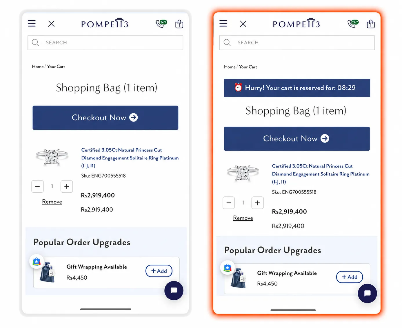
Creating Urgency With a Cart Reservation Timer
The original cart page allowed shoppers to proceed to checkout without any time-sensitive messaging. The variation introduced a visible cart reservation countdown above the shopping bag, encouraging customers to complete their purchase while their selected item was reserved.
Why This Test Won
Added a sense of urgency: key product and shopping benefits were visible before visitors explored the collection.the countdown gave shoppers a reason to complete checkout sooner.
Reduced purchase delays: time-sensitive messaging helped discourage customers from postponing their decision.
Strengthened checkout momentum: placing the timer above the cart kept attention focused on completing the purchase.
What We Learned
A well-placed urgency message can help maintain buying momentum at the cart stage and encourage high-intent shoppers to take action sooner.
Conclusion
The winning variation showed that adding a cart reservation timer can create timely motivation and help move more shoppers toward completing checkout.