Turning high-intent shoppers into more purchases through CRO research, stronger social proof, clearer product benefits, free-shipping messaging, and a smoother shopping experience.
$3.2M+
REVENUE ADDED
42
TESTS WON
56
TESTS RAN
The majority of our A/B Tests ran for approximately 2 weeks.
We strengthened social proof with customer reviews and recent purchase activity.
Key selling points and free-shipping messaging were made more visible across collection pages.
Collection page layouts were optimized to make product discovery clearer and easier.
Each experiment focused on reducing hesitation, building trust, and improving purchase conversion.
First Test
RESULTS
CVR Increased:
+35.20%
Monthly Revenue:
+$9,376
Highlighting Customer Reviews
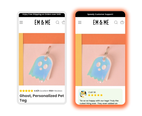
The original experience displayed a compact star rating and review count beneath the product image. The variant replaced this with a prominent customer testimonial card, adding a reviewer name, visual rating, and authentic feedback directly within the product experience.
Why This Test Won
Stronger social proof: a real customer testimonial provided more persuasive context than a rating score alone.
More engaging presentation: the review card created a noticeable trust element that was easier to scan and understand.
Reduced purchase uncertainty: showing positive customer feedback helped reassure shoppers about product quality and satisfaction.
What We Learned
Customer testimonials can build stronger purchase confidence when they are presented prominently and provide more context than aggregate ratings alone.
Conclusion
The winning variation showed that making customer reviews more visible and relatable can strengthen trust and help move shoppers closer to a purchase decision.
Second Test
RESULTS
CVR Increased:
+26.71%
Monthly Revenue:
+$4,876
Adding Free Shipping Messaging to Product Thumbnails
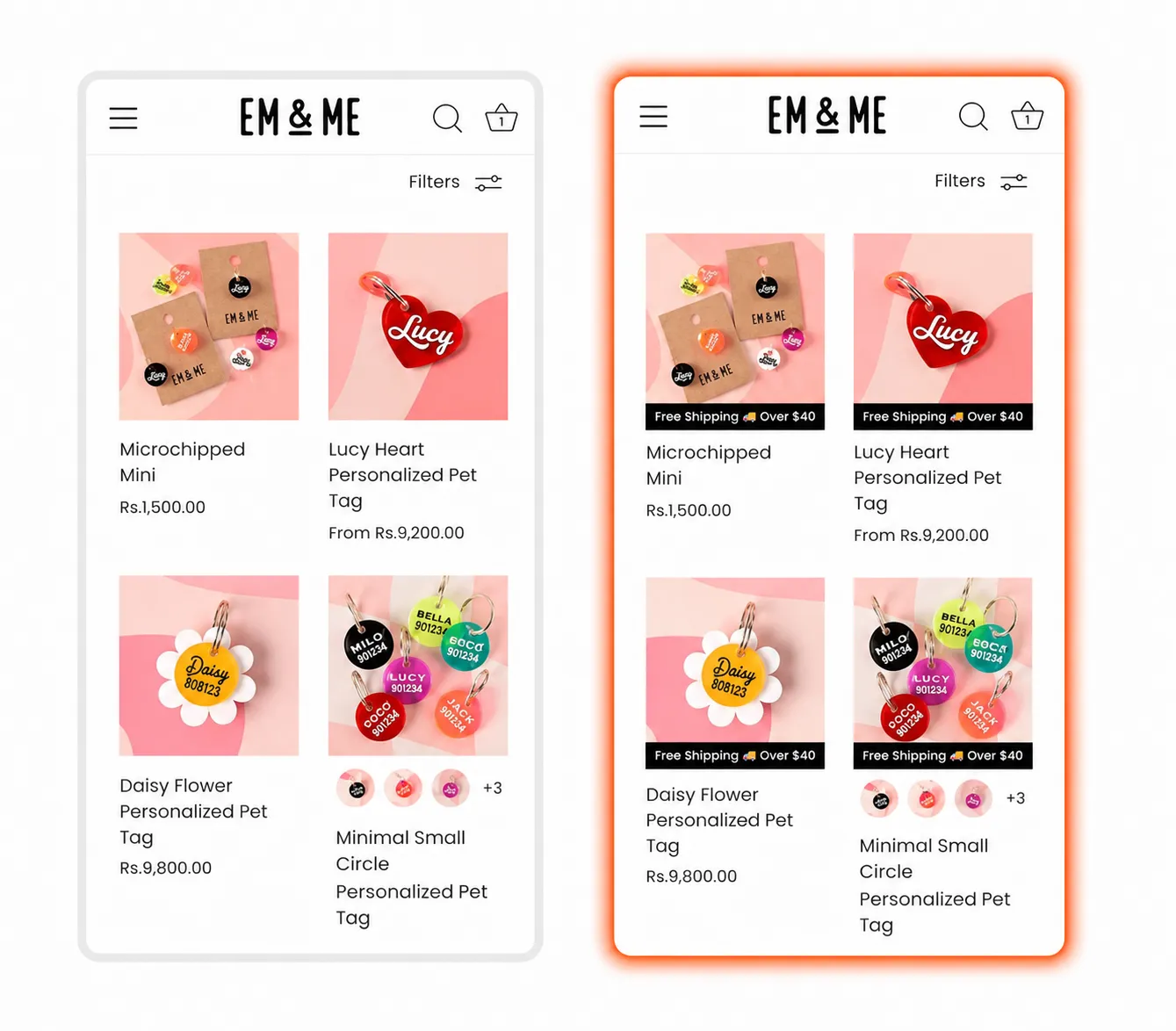
The original collection page focused mainly on product imagery, names, and prices. The variation introduced a “Free Shipping Over $40” message beneath each product image, bringing an important shopping benefit into view while customers explored different products.
Why This Test Won
Highlighted extra value: the shipping offer gave shoppers another reason to consider the products.
Improved offer visibility: customers could notice the free shipping benefit while browsing instead of discovering it later.
Supported purchase intent: showing a useful incentive near each product helped make the path toward purchase more compelling.
What We Learned
Bringing shipping benefits closer to products can make collection pages more persuasive and help customers recognize the overall value of the offer sooner.
Conclusion
The winning variation showed that highlighting free shipping during product discovery can improve value perception and encourage more shoppers to move forward in their buying journey.
Third Test
RESULTS
CVR Increased:
+54.53%
Monthly Revenue:
+$8,444
Adding Recent Purchase Social Proof
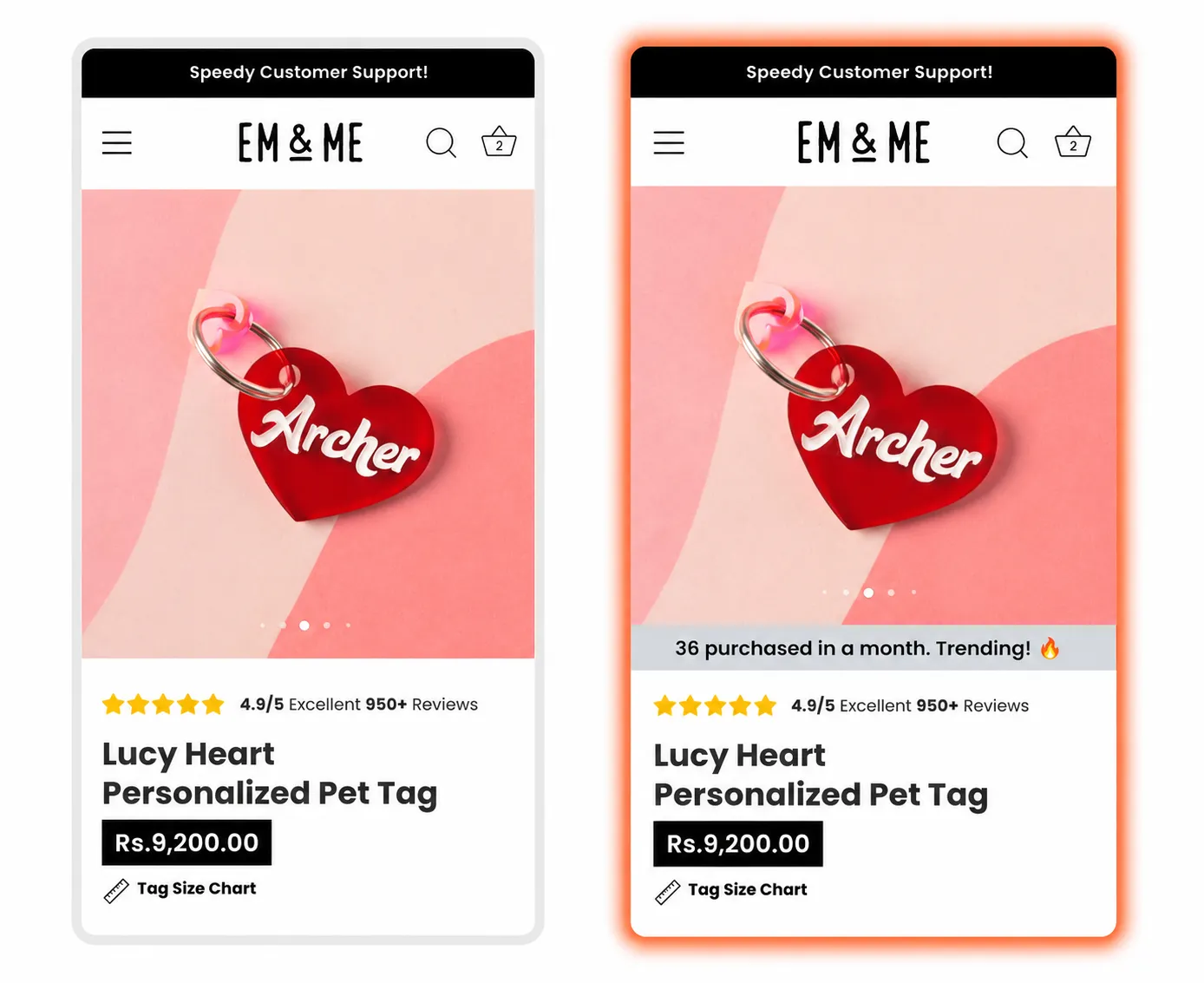
The original product page used customer ratings and review volume as its primary trust signals. The variation introduced a recent purchase notification below the product imagery, showing shoppers that the product was actively being purchased by other customers.
Why This Test Won
Created a sense of popularity: recent purchase activity made the product feel more desirable and proven.
Added timely social proof: shoppers could see that interest in the product was current, not based only on older reviews.
Encouraged faster decisions: the “Trending” message added subtle urgency while reinforcing buyer confidence.
What We Learned
Showing recent customer activity can make social proof feel more immediate and relevant, helping shoppers feel more confident about choosing a popular product.
Conclusion
The winning variation demonstrated that visible purchase activity can strengthen trust and product desirability, making it easier for shoppers to continue toward purchase.
Fourth Test
RESULTS
CVR Increased:
+73.35%
Monthly Revenue:
+$6,406
Adding USP Icons to the Collection Page
The original collection page moved shoppers directly from the page title to sorting and filtering options. The variant introduced a row of clear USP icons highlighting premium quality, free shipping, and design variety, while keeping the sorting and filter controls together in a single, streamlined row.
Why This Test Won
Stronger value communication: key product and shopping benefits were visible before visitors explored the collection.
Increased buyer confidence: messages around quality and free shipping helped address common purchase considerations early.
Cleaner product discovery: placing sorting and filtering controls in one row created a more organized browsing experience without taking attention away from the products.
What We Learned
Collection pages can benefit from communicating key selling points before shoppers begin browsing. Combining persuasive USPs with a cleaner navigation layout can reinforce value while keeping product discovery simple.
Conclusion
The winning variation showed that adding concise USP messaging and simplifying collection controls can create a clearer, more persuasive shopping experience.